watu wako: designing a score people can trust
How I designed the scoring system behind watu wako, my own product: a rubric, a score and an award that tell people honestly whether a Nairobi event is worth their night, and why it took eleven iterations to get there.
- Role
- Founder and product designer
- Type
- My own product, scoring system and design system
- When
- August to September 2026
- Tools
- Claude, Claude Code, Lovable, Notion
4.9

the roses & the score
- 5families
- 18event dimensions
- 6venue dimensions
- 9award bands
- 11iterations
Hundreds of events, no honest guide
Nairobi has hundreds of events every month and no honest way to tell which ones are worth it. The ticketing platforms that list them are paid by the organisers they would have to judge, so they cannot say "this one was badly run".
watu wako lists events widely and scores a few honestly, the way Michelin works for restaurants. That only works if the score is fair, understood at a glance, and rare enough to mean something.
Four rules before any screen
- Honest before flattering. A score that praises everything helps no one.
- Recognition over recall. The verdict must read in one glance, on a phone, in a group chat screenshot.
- Progressive disclosure. Verdict first, the full breakdown one tap away for anyone who wants to check our working.
- Earned, never bought. No organiser can pay for a score, a mark or a place on the list.
Eleven iterations
-
Iteration 01
Asking human questions
The first rubric used four abstract families: the room, the sound, the flow, the care. They sounded good and meant little. I rewrote them as questions a person actually asks after a night out. "Entertainment" became "what you came for", because a conference has no acts and a football match has no entertainment, but both have something you came for.
-
Iteration 02
A number that can hold a half
The original build brief stored the score as a whole number from 1 to 5, which could not hold a 4.5. The score became a decimal to one place, so two good events can still be told apart.
-
Iteration 03
Keeping every family equal
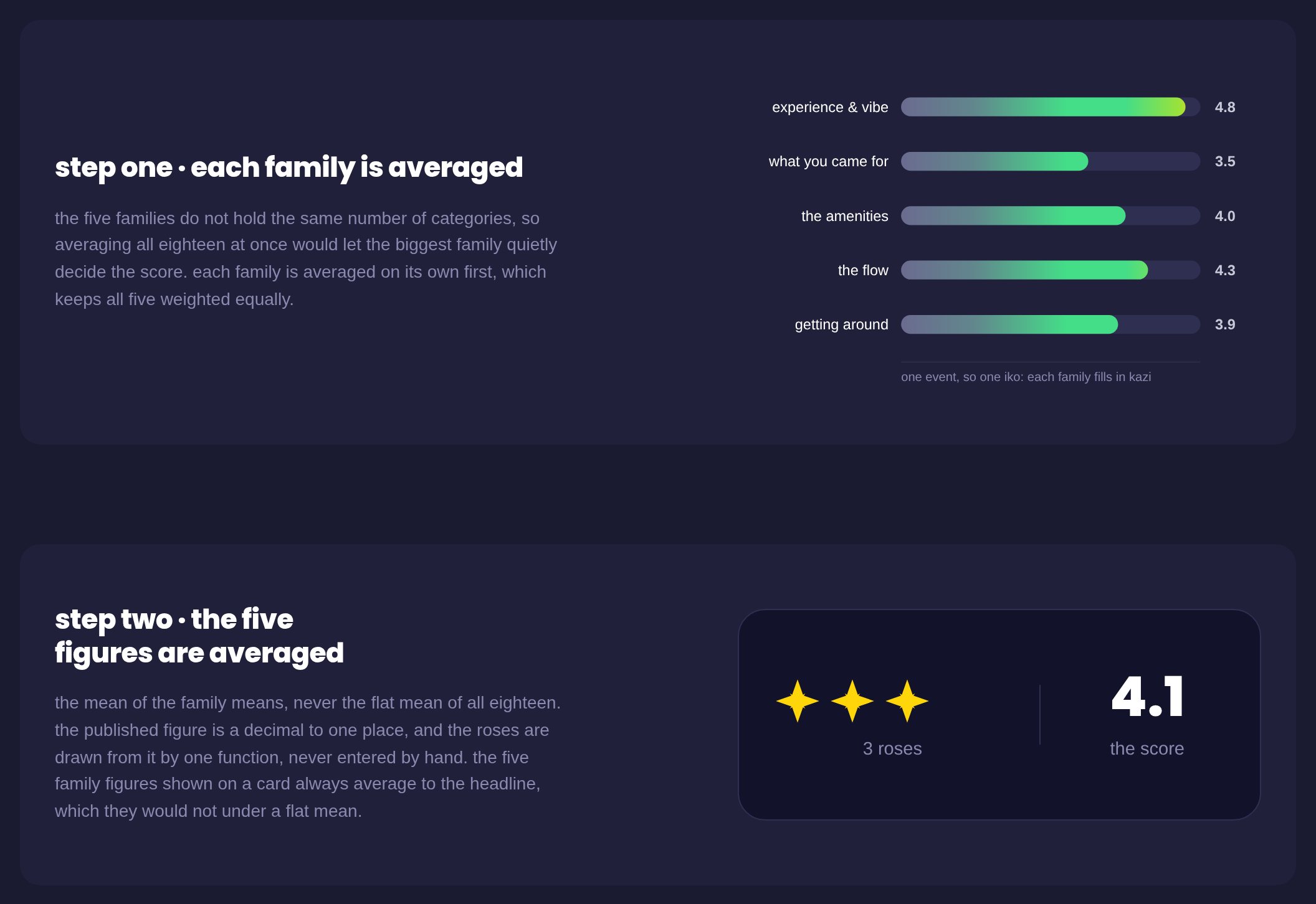
A flat average of every dimension let the biggest family quietly control the headline. The score is now the average of the family averages, so every family carries equal weight and the family figures on a card always add up to the headline a person sees. Consistency here is what makes the number believable.
watuwako.com/score, step one and step two -
Iteration 04
Splitting a family that did two jobs
One family, "the flow", was carrying seven of eighteen dimensions and two different jobs: how the event was run, and how a person moved through it. I split it into "the flow" and "getting around", and added accessibility, which finally had an honest home.
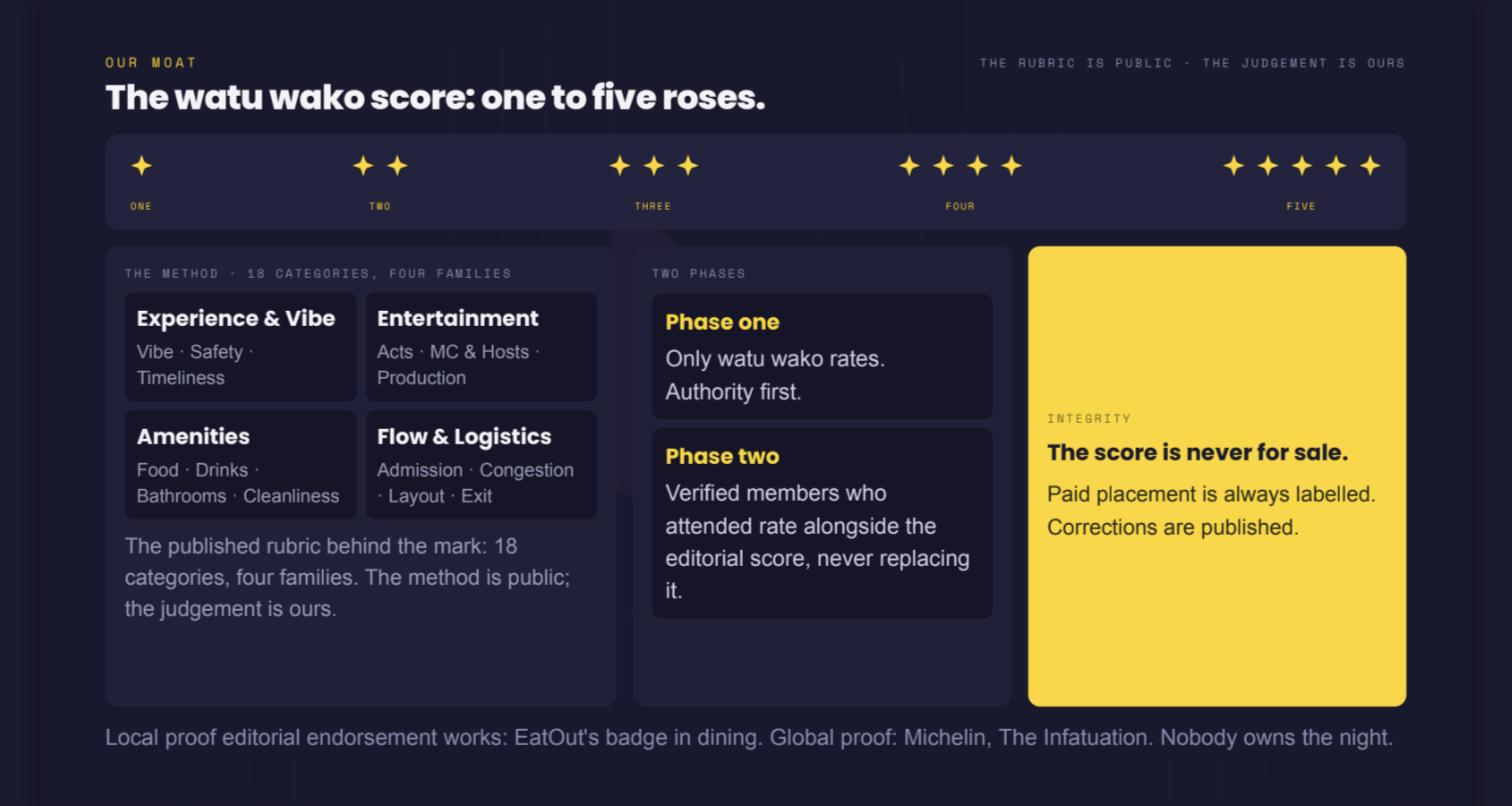
July 2026 pitch deck: 18 categories in four families, before the flow was split in two. -
Iteration 05
Judging the right party
A dirty bathroom at a party is the organiser's doing on the night; a venue's permanent layout is not. I separated the system into two instruments, an event score and a venue rating, so one bad promoter never damages a good venue and a loved venue never lifts a badly run night. "Congestion" became "crowd control", because we measure what the organiser did about the crowd, not whether a crowd existed.
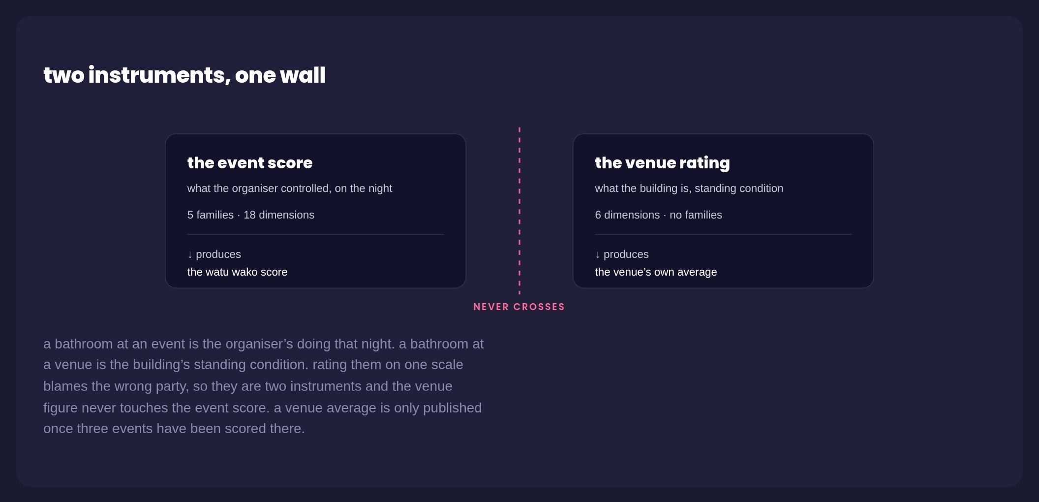
watuwako.com/score, two instruments, one wall -
Iteration 06
No zero, and a fair exception
A zero looked simple and was not. 1.0 already means "absent or unusable". The real problem was that an event with no catering would be punished for food it never promised, so I allowed exactly two dimensions, food quality and drinks and pricing, to be set aside as not applicable. Nothing else can be skipped.
-
Iteration 07
Basics are gates, not points
Water, toilets and a contactable host are not scored. They are checks that block a score from publishing at all. Folding them into the average would have let a great lineup paper over a failed basic.
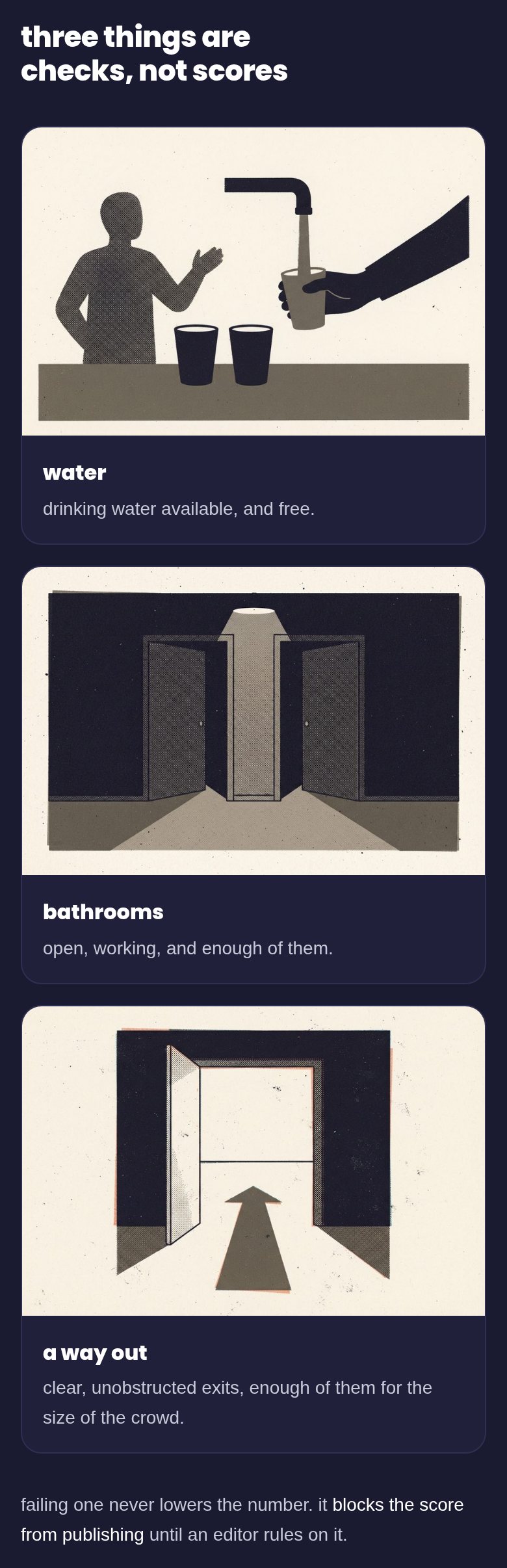
watuwako.com/score, the checks -
Iteration 08
A rating control that shows its anchors
The prototype used a horizontal slider, which invites people to drift to the middle. I replaced it with a vertical column that fills like liquid, with the 1, 3 and 5 anchors written beside it, so a rater can see whether they are landing on a level or between two. Visible anchors make ratings from different people comparable.
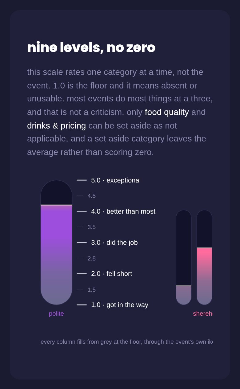
watuwako.com/score, the rating columns -
Iteration 09
Separating the measurement from the reward
This was the biggest shift. Early screens showed a rose at every score, so an event rated 1.0 still displayed a rose and a line reading "worth the trip if it's your thing". That undercut the whole point of an honest score.
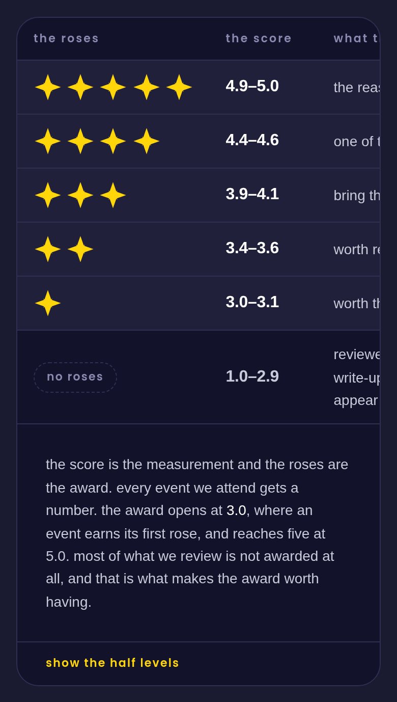
I separated two things that had been tangled: every attended event gets a score from 1.0 to 5.0, but roses are an award, and the award starts at 3.0. Below that, an event is published honestly as "reviewed, not awarded", with no rose row at all. Scarcity is what makes the mark worth having: watu wako expects to score only a small share of events, and award fewer still.
Two scales. Every attended event gets a score from 1.0 to 5.0; only 3.0 and above earns roses. The first build of this rule was wrong in an instructive way: it put a 3.0 event at three roses, which made the lowest award levels impossible to earn. I now keep a standing test for any mapping: every one of the nine levels must be reachable.
How a score becomes an award Score Roses 3.0 to 3.1 1 3.2 to 3.3 1½ 3.4 to 3.6 2 3.7 to 3.8 2½ 3.9 to 4.1 3 4.2 to 4.3 3½ 4.4 to 4.6 4 4.7 to 4.8 4½ 4.9 to 5.0 5 below 3.0 reviewed, not awarded -
Iteration 10
Show only what was earned
The badge first drew five rose positions, greying out the ones not awarded. The grey roses read badly: people saw what an event failed to get instead of what it earned. Now a badge draws only the roses awarded, and half a rose is literally the left half. A small change in framing, a big change in how the award feels.
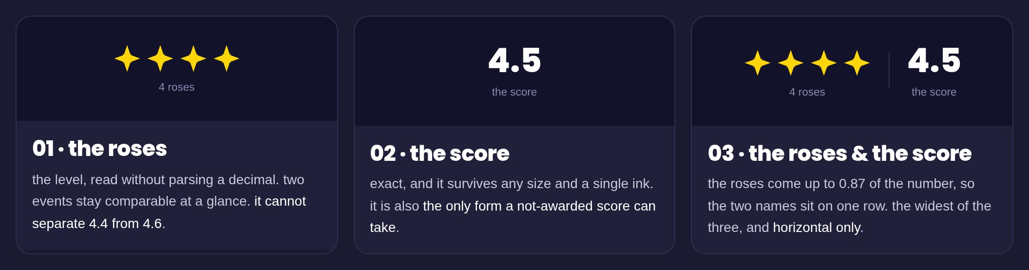
watuwako.com/score, the mark -
Iteration 11
A badge that works everywhere
The score number was set in a heavy typeface that turned out to be missing on Android, which is most phones in Nairobi, so the most important glyph in the product was silently falling back. I moved it to the heaviest weight of the brand typeface already loaded on every page.
Then I rebuilt the badge itself: 224 exported badge files became one design system component that takes a score and draws the right award, so the next rule change is one edit instead of a re export.
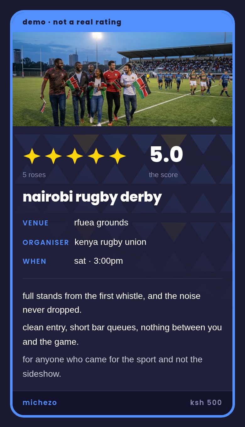
watuwako.com, a demo event card
Where the score lives
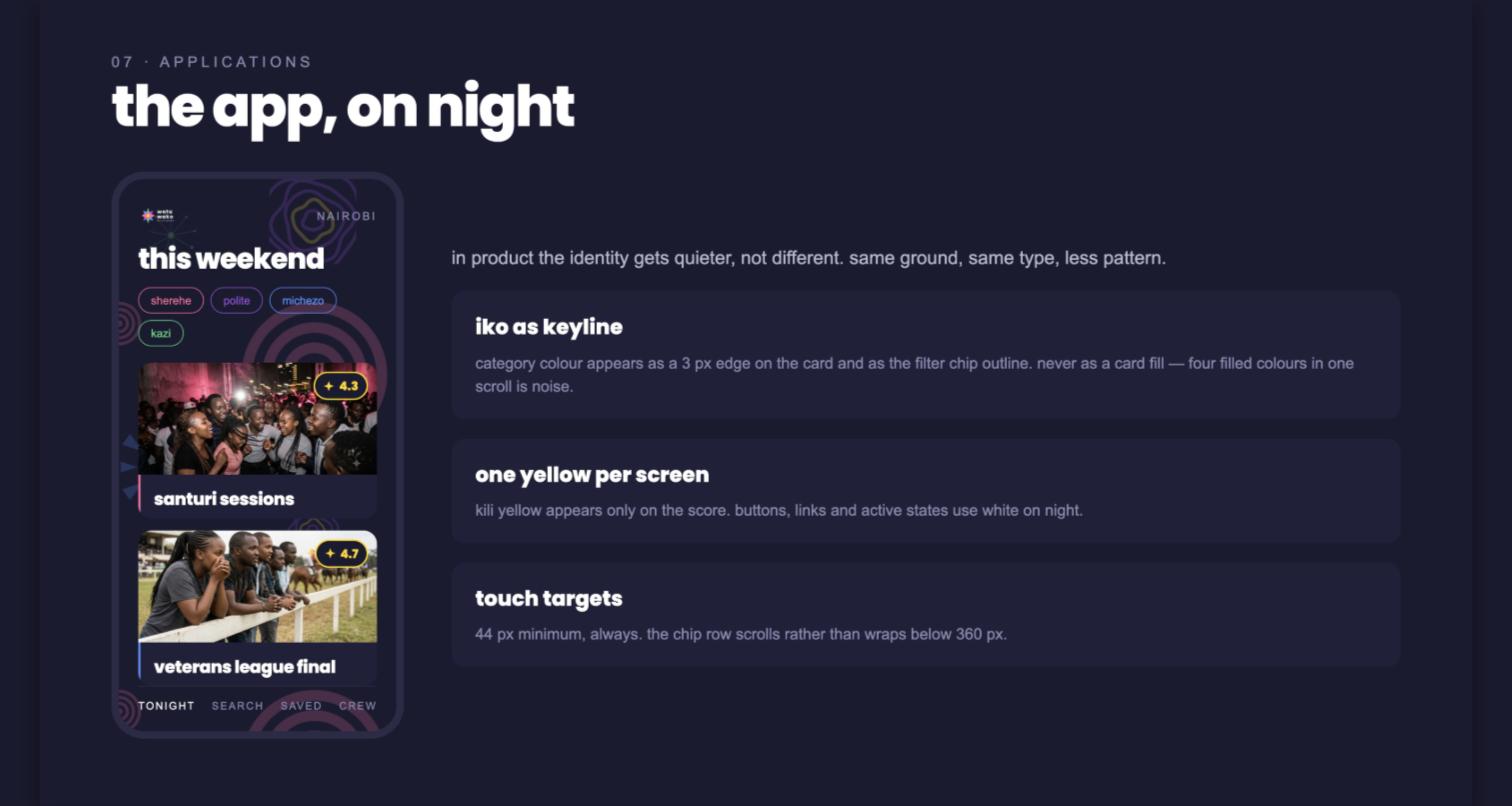
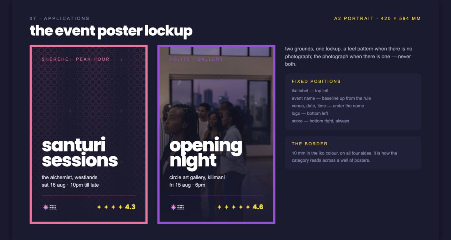
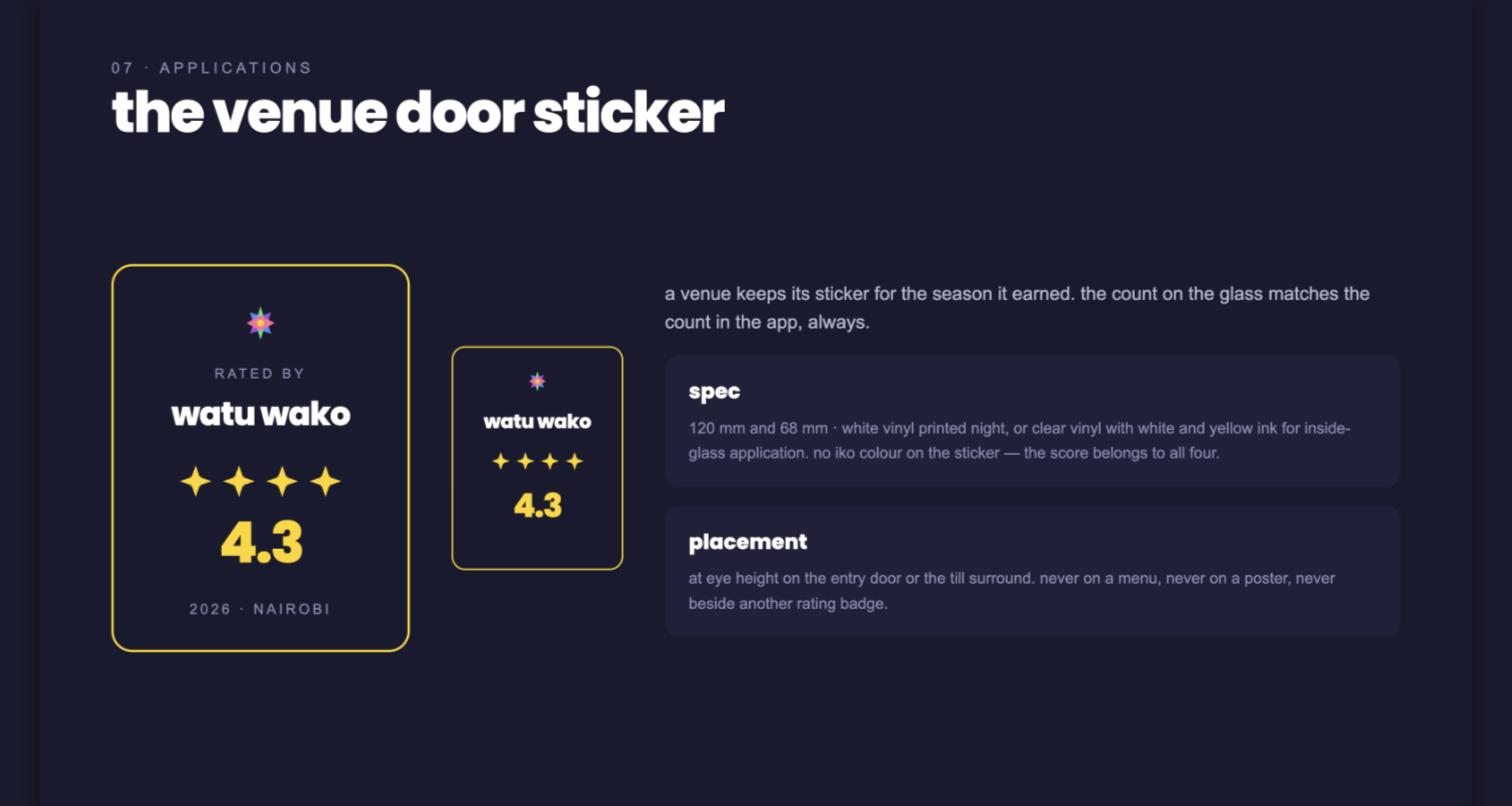
These boards are from August 2026; their rose counts predate the nine award bands.
The sustainable drives only
I design with the Octalysis framework, and watu wako leans on its most sustainable drives.
- Accomplishment: roses are earned against a public rubric.
- Scarcity: most events are reviewed and not awarded, which is what gives an award its value.
- Social influence: the badge is built to be screenshotted and forwarded into group chats, which is how people already decide where to go.
- Epic meaning: members are building an honest guide to their own city, and organisers compete to earn the mark, which pulls the best events toward the platform.
I deliberately left out the manipulative drives. There are no streaks, no pay to win and no bought placements, because a score that can be bought stops meaning anything.
Measure and reward are different questions
- Separate what you measure from what you reward; they answer different questions.
- Write down the checks that prove a rule is right, and treat an impossible result as a bug, not a question.
- Keep one source of truth: the rubric lives in a single file the product reads at runtime, so the published score can never drift from what raters use.
- Build components, not file sets, when the rules are still moving.
watu wako launches in October 2026. Book a call if you want the full walk through of the rubric and the review desk.
Book a call
Let's make something people can actually use.
Available for contract work from October 2026. Tell me about your product and the people who use it.