Reducing an enrollment flow from 10+ minutes to just 2
Relief for myAgro sales agents: a guided, one action per screen enrollment flow for the app that serves smallholder farmers across West Africa.
- Role
- UX designer
- Organisation
- myAgro
- Users
- Village Entrepreneurs, field sales agents
- Type
- Shipped mobile app
- 10+ minto enroll a farmer before
- 2 minto enroll a farmer after
- 3crowded screens before
- 1action per screen after
The most important step was the slowest
myAgro helps smallholder farmers save little by little toward seeds, fertilizer and tools. For field sales agents, called Village Entrepreneurs, enrolling farmers is the first and most important step. It took more than 10 minutes, spread over 3 overcrowded screens.
Surveys and interviews with agents showed why:
- 3 dense screens full of small inputs
- fields the flow did not need
- two payment methods, scratchcard and mobile money, each with a different flow
- the result: frustration, dropout and low adoption
“It's faster for me to use my paper notebook than the mobile app's flow.”
Sales agent, field research

Enrollment, rethought as a guided lesson
I benchmarked learning apps, which walk people through something new one small step at a time, and used that idea to rethink enrollment as a guided lesson.
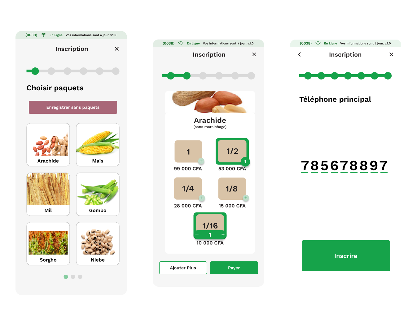
Gamification gave agents a sense of where they were and what came next: progress indicators, colour coding by flow, and one action per screen, like levels in a game.
Four principles held the work together:
- Progressive disclosure: show only what is needed now.
- One clear action per screen.
- Consistency across enrollment, packages and payments.
- Accessibility for low literacy.
Package size selection alone went through seven feedback rounds in Figma. A Maze test removed an option nobody used, and a field trip to Casamance in Senegal tested the flow in context, with agents enrolling real farmers.

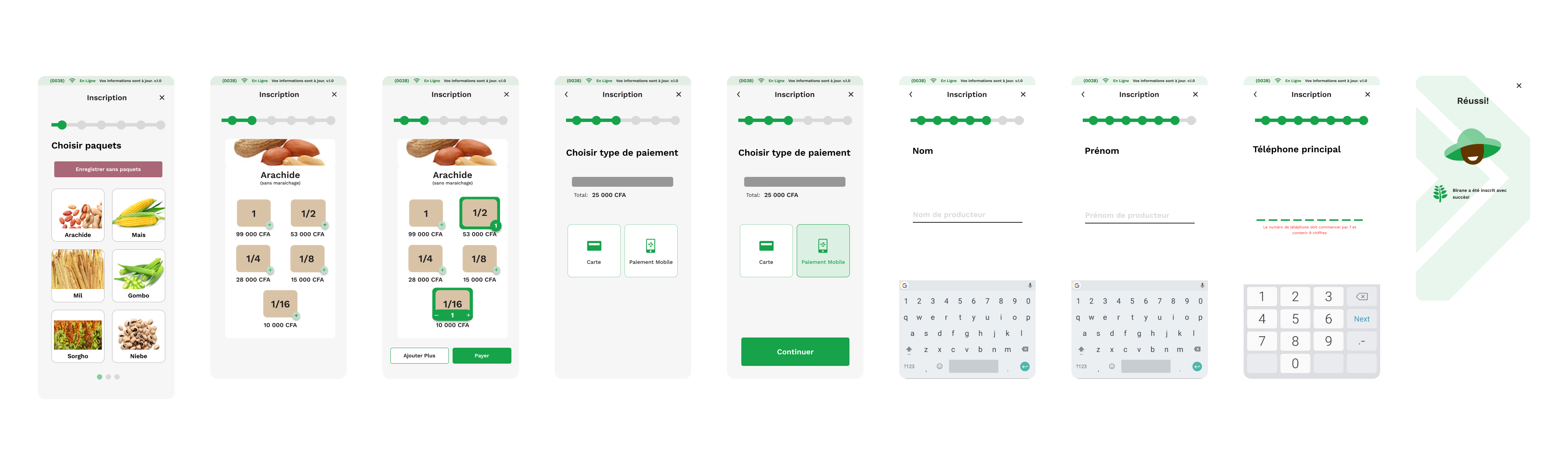
One action per screen, and always knowing where you are
- Each screen asks for one thing.
- A progress bar shows the total number of steps and the agent's position.
- Flows are colour coded: registration only, or registration plus packages plus payment.


Before
- 3 crowded screens
- No guidance
- Repetitive, error prone inputs
After
- Registration only: 4 screens
- With packages and scratchcard: 7 steps
- With packages and mobile money: 6 steps
From over 10 minutes to about 2
Enrollment dropped from over 10 minutes to about 2 minutes, even though the new flow has more screens.


What simplifying cost
Cutting fields that could be filled in later made enrollment fast, but it also meant about 280,000 farmers had no age recorded and about 70,000 had no gender. So I designed a flow for agents to modify a farmer's details afterwards and recover that data. Simplifying a form moves work somewhere else; the job is to decide where it should land.
More screens can be faster
Fewer screens is not the goal. When each screen asks for one thing and agents can see how far they have to go, a longer flow finishes sooner.

Let's make something people can actually use.
Available for contract work from October 2026. Tell me about your product and the people who use it.